So, I’m behind schedule. As I have practically been all along. We’re actually in Week 5 of Knight Center’s phenomenal “Introduction to Infographics and Data Visualization” hosted by the equally phenomenal Alberto Cairo. The task this week was to take a look at the unemployment rates in the US under President Obama. The task, more specifically, was to try to better the Guardian’s effort and sketch an interactive graphic. Now, the Guardian blog is usually just about the best source for new data out there, but their graphics are usually not even close to the class leader, New York Times. No one’s is, truth be told, and I bet the Times’ budget is pretty astronomical compared to many others’. Including the Guardian’s. So all is as it should be. Further, most of us in the course are not even close to the level of the Guardian’s worst efforts. So there.
I have actually worked with this all week, but never actually finished my thoughts before moving on to something else. So, after having messed around in Google Fusion Tables (great tool; first time I tried it), Tableau (on my incredibly slow work PC) and Microsoft Excel, I concluded that I wanted to do something else. For no valid reason, but nonetheless. Google Fusion Tables is not available for Google Apps, which annoys the faeces out of me, Tableau is Windows only, and I have used pen+paper, Tableau and/or Excel+Illustrator for the first exercises. So, something new this time around. Which is of course putting an extra workload on myself in some incredibly busy weeks. That’s how exiting I find this course. I want to learn, learn, learn!
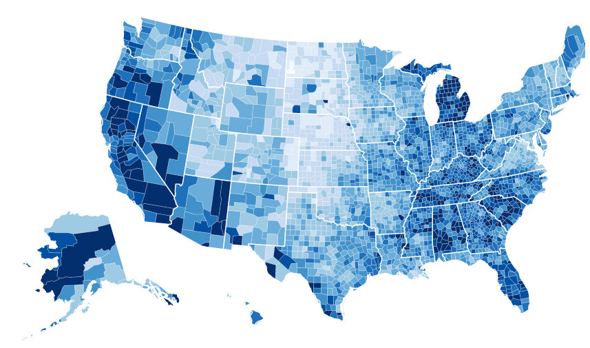
Anyway, my conclusion was that this was surely the time to have my first ever look at D3.js (I did say I wanted to!). As I’m a pretty lousy coder, I also concluded that Google Public Data should act as my backup. And well, here we are. Below is basically only Google Public Data stuff (and hence not annotated with e.g. president), and a gorgeous unemployment map I have simply copy-pasted from a map by the King of D3, Mike Bostock. In effect, I haven’t really used the data we were supposed to look at, but that which was available through Google Public Data as that was the best way to explain what I wanted to achieve.
Anyway, I learned a lot in the process, and will definitely look more into D3.js. I have tried for hours to make a legend for the map. With no luck, obviously. Next time! Here goes.
Unemployment keeps falling
After a rapid rise in unemployment (seasonally adjusted) through the end of George W. Bush’s presidency and the beginning of Barack Obama’s, (spring 2008 and all the way through 2009), the general pattern for the US seems to be one of falling unemployment.
Although the crisis hit harder in the US than in many other parts of the world in 2008 (under George W. Bush), the current economic policies in the Euro Countries and the US, make the IMF think that the US will gain much more in the coming years than their European counterparts.
The crisis hit different people in different ways
Although the fluctuations seem to be the same for all age groups, the trend is clear in both good and bad times: The younger you are, the more likely you are to be unemployed.
And the women who are part of the workforce don’t seem to be hit by the economical crisis in the same way as men (I would have loved to look more into which employment groups were hit the hardest – some job types typically mainly filled by men such as construction are probably high on the list).
Geographically, there are also major differences, especially in absolute numbers. All states seem to have had the ame turbulent time, though.
I’m impressed that you tried to tackle a new tool for this exercise. I tried my hand at Illustrator and I after spending two evenings watching the videos and poking around, I decided that it would be my assignment for week 7 and I reverted to InDesign.
It’s funny that you used Google Public Data explorer – why not, if we can use Tableau and other tools. It is a great tool with some nifty interactivity that I used in another class to show a story. The colors are clear and the animations are elegant.
Regarding the difference between the impact on men and women, you may have heard of the “mancession”. I didn’t know it was more or less over, so I learned something. http://www.thenation.com/blog/166742/have-we-gone-mancession-shecovery-not-quite
Beautiful map. I’m surprised that so many students are using more than one color in the choropleth maps. I read, I think in Designing Data Visualizations http://shop.oreilly.com/product/0636920022060.do, that it’s easier for the eye to follow a single-color gradient. I don’t recall Cairo making this point though.
By the way, is this a WordPress theme? Interesting layout. I just started on WordPress and I’m a bit disappointed in the limitations to the customizations that we can do. It looks like we have to buy into a them or become coders. Anyway, I’m glad I found your blog and I will follow what you post.
Thanks for that, Francis. And thanks for pointing me to that the Nation article about mancession and shecovery. I hadn’t read that one before – or even heard of the terms. Funny that they didn’t use any data visualizations in a story based on quantitative data trends, though!
And yes, Iliinsky and Steele make the saturation-not-hue point in Designing Data Visualizations:
Nathan Yau makes a similar point in “Visualize This“:
I would add the obvious case of elections to Yau’s examples of times where different colours adds a lot to the map.
And yes, this is a WordPress theme. I use a only slightly modified “Meola“. It’s a paid theme, but it’s cheap (€12), very well coded, and so nice to work with. You can’t use that on wordpress.com, though. I’m sure you just haven’t found the theme section there yet, as there are thousands of themes to choose from. I think you should go for a responsive theme (automatically resizes e.g. images for mobile) with either one column (like here) or two in order to make as much room as possible for graphics. Use the “Feature filter” next to the search box to narrow down the choices. I personally really like “Hum”, “Publish”, “Runo Lite”, “Yoko” (the first theme made by the theme authors of my theme), and the new standard WordPress theme, “Twenty Twelve”. They are all free and generally have quite a few customization options.