I finally found a good excuse to play around with RAW (made by the amazing people from Density Design). I have tried a few times before, but it quickly showed that I had too much data. Wanting to do stuff with a lot of data in a browser is really not such a good idea, but I really wanted to use RAW.
Anyway, yesterday we at UN Global Pulse announced a partnership with social data provider DataSift. Thanks to that partnership, we have been able to do a big project on the Post-2015 agenda together with the UN Millennium Campaign. The Post-2015 agenda is basically a process where the UN, civil society, governments of the world, and so on agree on a set of goals to aim for when the Millennium Development Goals end in 2015, so we went for rather broad stokes and global coverage. Global coverage pretty much means social data, so the partnership with DataSift really came in handy!
About a year ago, we created a microsite with crude numbers and three data visualisations.
A Spinning Globe

The spinning globe showing the top-20 countries talking on Twitter about 16 different development topics as they were defined in the massive survey MY World. We chose the spinning globe, as we had to create a visualisation that would be good for an exhibition taking place at UNICEF HQ. That meant that we wanted an interactive visualisation that could potentially update and be explored while passively looking at it (in the end we did manage to get a mouse connected, though). The main takeaway (or story!) we wanted to show was that these 16 very diverse development topics are talked about all over the globe. One problem is not just a problem for a particular continent or similar. Hence, a globe giving you a tour of the world seemed appropriate. And thanks to Mike Bostock, the skeleton had already been laid out.
A Trend Graph

We also included a trend graph showing how much the 16 topics are talked about monthly in 193 different countries. One of the first questions we get is usually “How about my country?”, so we definitely needed the ability to drill down a bit. We also added basic lists of most used words (unigrams only) when hovering over each data point, so the user can get a basic answer when asking the question, “What do people talk about when they talk about topic X?” We went for dimple on this one (mainly thanks to the fairly easy use of an interactive legend) and a simple MySQL database for word count lookups. The graph is slightly buggy, so we may go in another direction at some point if time allows.
A Map

Finally, we also included a map of the world where you can choose between the different topics. The trend graph makes it possible to look at one country at a time, while the map makes it possible to look at one topic at a time. We used CartoDB for that one.
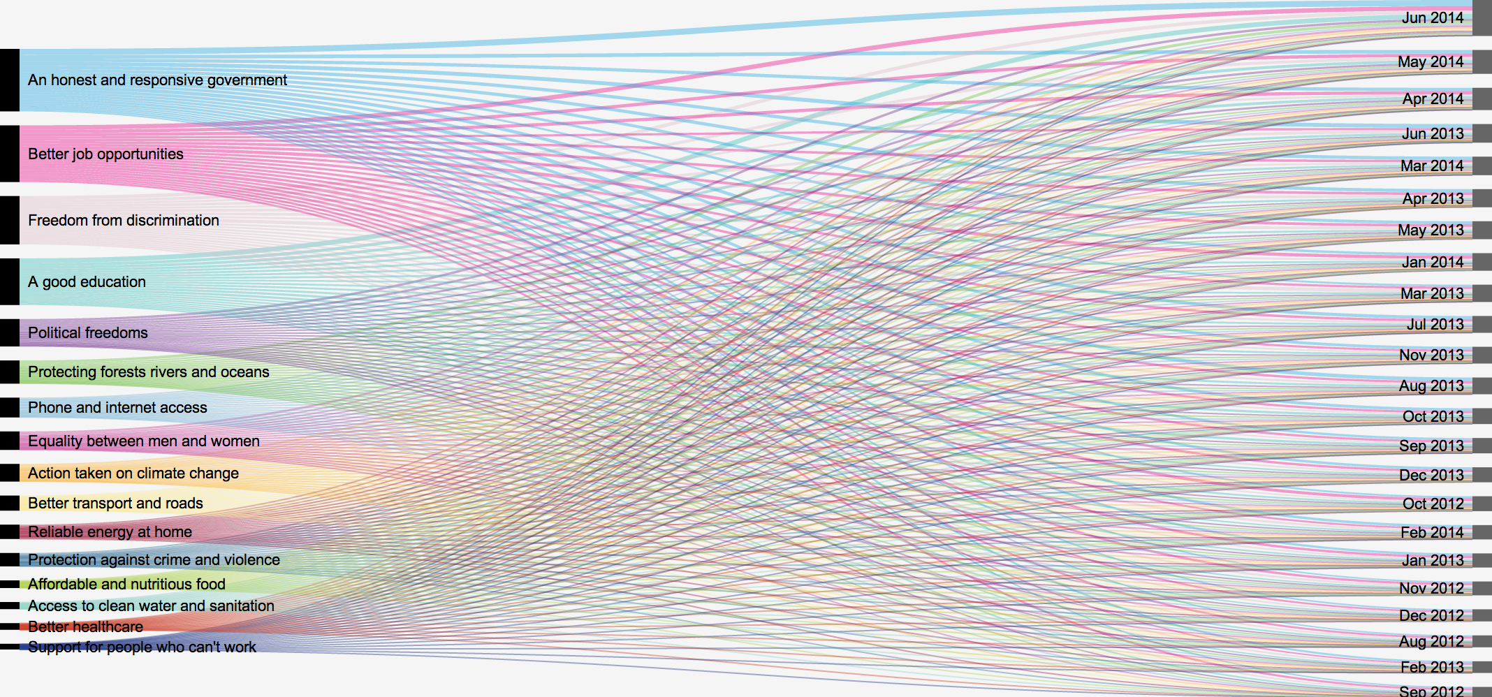
New: A Bipartite Graph
Now, to celebrate that the partnership with DataSift was all wrapped up, I wrote a blog post yesterday on the Global Pulse blog, called “Sifting Through, and Making Sense of, Big Social Data” where I for example wrote about creating a taxonomy consisting of 25,000 keywords. Yes, 25,0000 keywords. Not your ordinary hashtag monitoring…
It also happened to be the day where we updated the microsite with data from June, seeing the full dataset get above 200 million tweets. To be precise, we have now categorised 206,784,678 tweets from 35,474,126 Twitter users into 16 development categories. To me that meant that it was time for a new data visualisation. We haven’t really looked much at global aggregates as it would be heavily biased towards users from especially the US, UK, Canada, and Australia, but as this was a quick celebratory visualisation, and not meant for policy decisions, I thought it was time. So this is what I created for the “Sifting Through, and Making Sense of, Big Social Data” blog post:
RAW includes Density Design’s old Fineo visualisation, and I really like those. And I especially like them when used with only two axes, making it into the more traditional bipartite graph. Each individual line is rather unimportant, while the overall most dominant colours do show you what’s most important. Most importantly, though, the sizes of the nodes are what you want to look for if you’re looking for rankings of either most talked about topics, or when we found the most tweets (Twitter seems to be just growing and growing). And, well, the nodes are already ranked, so there.
RAW makes it possible to resize the nodes, and I did play around with very wide nodes to make it apparent that that’s where a lot of the information is. But the readability (basically reading the differences in height of nodes) seemed to be just about the same whether they were 15 or 150 pixels wide. So I went with the better looking 15px.
I also considered making the tooltips (when hovering over the nodes) look better, but didn’t really think it was worth it (RAW doesn’t give you that option). I also considered re-colouring the text labels or giving them a background, but again, couldn’t be bothered. It’s simply good enough as it is!