Bitsy Hansen (aka Bitsy Bentley) has another great piece on Forbes today. This time it’s on the “Data Visualization Landscape“. Her main point is that making great graphs is not just about prettying up the things your data guys come up with. It’s a continuation of her previous post, “This Business of Data Visualization” where she wrote:
The data visualization community is filled with smart, opinionated people arguing about the semantics of visual perception and design. There are many impassioned arguments from the statistically savvy about the proper methods of visual encoding of data graphics, and just as many dilettante designers twisting the visual language of data to suit an expressive goal. The dirty little secret is, there’s room in the landscape for all these approaches, provided that we recognize that different audiences have different needs when it comes to information design.
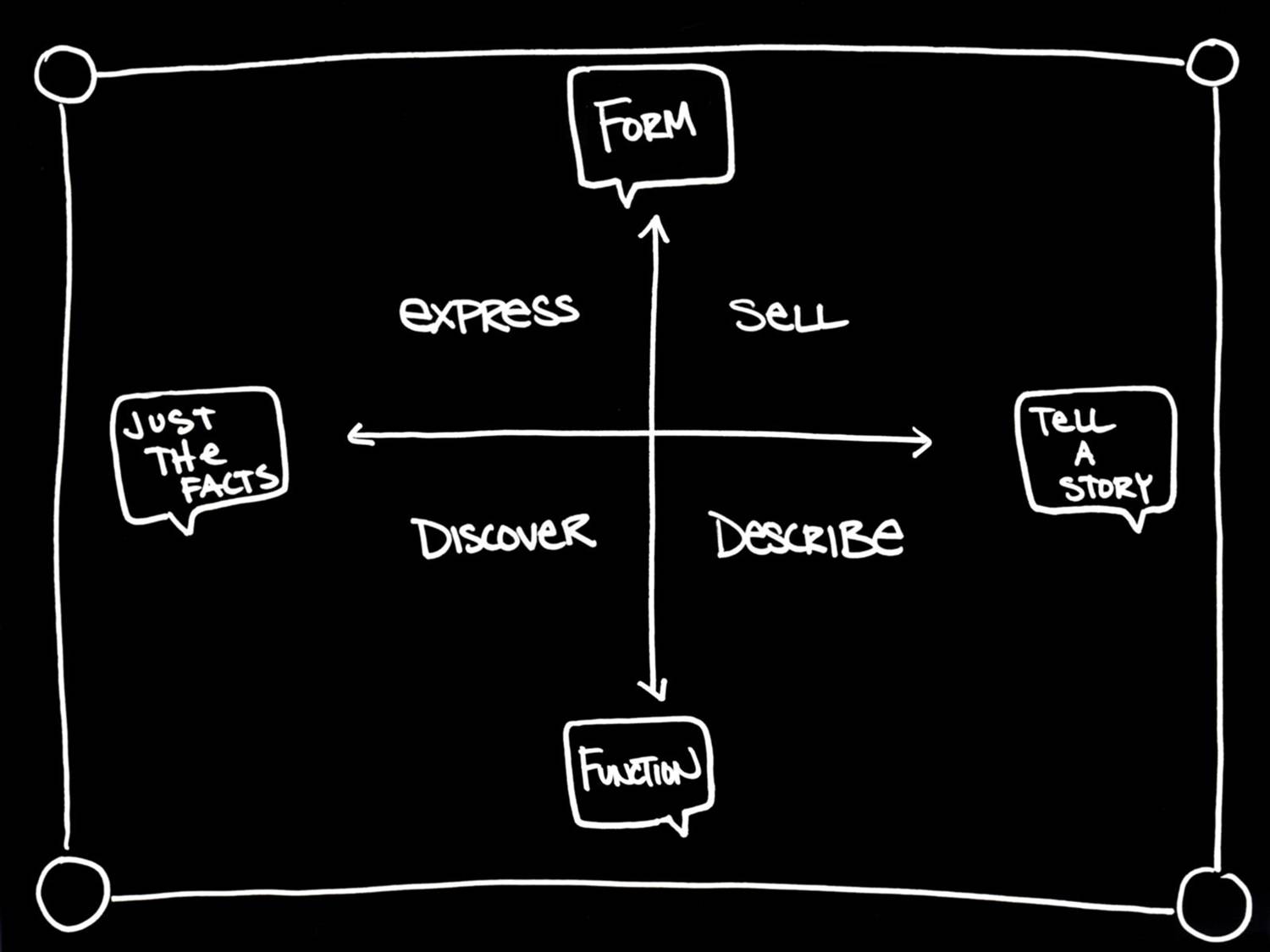
This time around she talks about the wow-aha continuum where some want to make daunting graphics the most important part (form) and others prefer to let the data speak as clearly as possible although it might not be pretty (function). She also includes the facts-story continuum which gives the idea another interesting dimension.
What she doesn’t dwell on, is the thing that I find the most interesting to talk about: the continuumness. It is extremely important to remember (and I believe that’s the whole point of the quote above) that some might go all in on the visual wow factor, and some present data in a way where you are led to believe they gave it their best shot to make it dull and uninteresting. But it is rare.
Bitsy Hansen gives us four different target groups:
- Express (facts and form)
- Discover (facts and function)
- Sell (story and form)
- Describe (story and function)

How does her graph fit in to her own graph? I would say it describes her point pretty well. But it’s not much more than the facts, is it?