November 2012

Introduction to Infographics and Data Visualization, Week 4

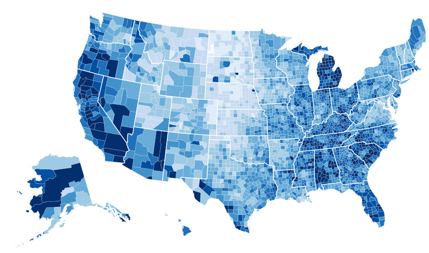
So, I’m behind schedule. As I have practically been all along. We’re actually in Week 5 of Knight Center’s phenomenal “Introduction to Infographics and Data Visualization” hosted by the equally phenomenal Alberto Cairo. The task this week was to take a look at the unemployment rates in the US under President Obama. The task, more […]

Introduction to Infographics and Data Visualization, Week 4 Read More »

Data Visualization Goals in Historic Context

Robert Kosara of eagereyes (and Tableau) just published a great walk-through of the history of data visualizations. Or, rather, the main goals of different data visualization giants during the course of history. It really gives you a great understanding of why we are now torn between infographics and data visualizations (read: Robert Kosara’s [INFOGRAPHIC] vs. data visualization dichotomy, ie.

Data Visualization Goals in Historic Context Read More »

Scroll to Top